
8 min read
What is in Opt-in page?
An opt-in page is a type of landing page with one goal – to collect the email address of a visitor to the page.
In today’s post we’ll cover why you need to use an opt-in page, and we’ll share some of our favourite examples of opt-in pages to help inspire your own design.
By the end of this article, you’ll be armed with everything you need to create your own opt-in page from scratch.

Learn What’s Working Now from 120+ Top Landing Pages in our FREE Guide
Get Access to 120+ Landing Page Swipes from Creators, Digital Marketers and Experts + insights and steps to boost your landing page conversions.
Why use an opt-in page?
The main purpose of getting a visitors email address is to build a relationship and to help you make sales.
Opt-in pages have one clear objective in order to ensure that the visitor remains focused on your conversion goal.
In short, the more engaged and motivated the visitor is in opting in, the higher the opt-in rates will be, which is the key to having a lucrative list and allowing you to nurture the relationship further.
This is crucial for building authority and trust, which will later, allow you to sell your products and services and generate revenue in your business.
Table of contents
Opt-in page components
Opt-in pages have evolved throughout the years as landing page builders have improved, but the core components remain the same.
In fact, the more simple your opt-in pages are, the better your opt-in rates will be.

A good opt-in page will typically have 4 core components:
A Compelling Headline
The main objective of a headline is to grab the reader’s attention.
In order to write a compelling headline, it’s important to know the wants and needs of your potential customer.
Knowing this will allow you to write a headline that explains how your product or offer solves the problems your audience is facing.
The better you’re able to identify the problems and solutions of your target audience, the more likely they will be to opt-in to your email list.
Here are some example headline frameworks to help you get started:
Our post on constructing a good headline can give you more guidance as you start to write your own headlines.
Bullets & Features
The main goal of bullets and features is to describe all of the benefits that your visitor will get for opting into your email list.
Typically, this could be a free download like a lead magnet, a mini course or access to a webinar.
As with headlines, spending time writing good bullets will drastically improve opt-in rates and ensure that you build a list of targeted email subscribers who want to learn more from you.
Here are some bullets you can use to help you get started:
A Lead Form
The lead form is where your visitor will enter their contact details in order to gain access to the lead magnet or opt-in incentive you’re offering.
Typically, this will contain the name and email field.
In our experience, reducing the number of fields will result in a higher opt-in rate. You may wish to test collecting only email – this just means you are not able to personalise your emails to prospects on your list.
A Clear CTA (Call-To-Action)
The goal of the call to action is to encourage the visitor to complete their opt-in and subscribe to your email list.
We recommend using enticing phrases and words that encourage the desired action.
Some examples may include: “Send me my free gift”, “Give me access”, “Yes, show me more”.
As you can see, in looking at the 4 key components, all of them put together are geared to encourage and invoke the desired action.
When used in combination, it is very powerful and will ensure your get the most out of your opt-in pages.
Of course, the best way to showcase this is by way of example…

Learn What’s Working Now from 120+ Top Landing Pages in our FREE Guide
Get Access to 120+ Landing Page Swipes from Creators, Digital Marketers and Experts + insights and steps to boost your landing page conversions.
Opt-In Page Examples
We’ve compiled a list of 11 of our favourite opt-in page examples; highlighting key sections that stand out, breaking down what we like and what could be improved.
1. Todd Herman – Mentoring Guide Landing Page

In this example, Todd Herman uses a long-form landing page to promote his lead magnet.
He includes his offer above the fold, which is the first thing visitors will see upon landing on the page, which is crucial for highlighting the purposes of the page.
It gives visitors the option to opt in and to skip reading through the page contents.
What we liked:
What can be improved:
2. Gemma Bonham-Carter – Lauch Email Swipes

Gemma Bonham-Carter’s Launch Email Swipes is a great example of a 2-step opt-in landing page. A 2-step opt-in uses an opt-in form that appears after the visitor clicks the initial call-to-action button.
This is a great strategy for increasing visitor commitment by encouraging them to take an extra step.
Upon clicking, the visitor is shown the opt-in box with a call to enter their contact details.:

What we liked:
What can be improved:
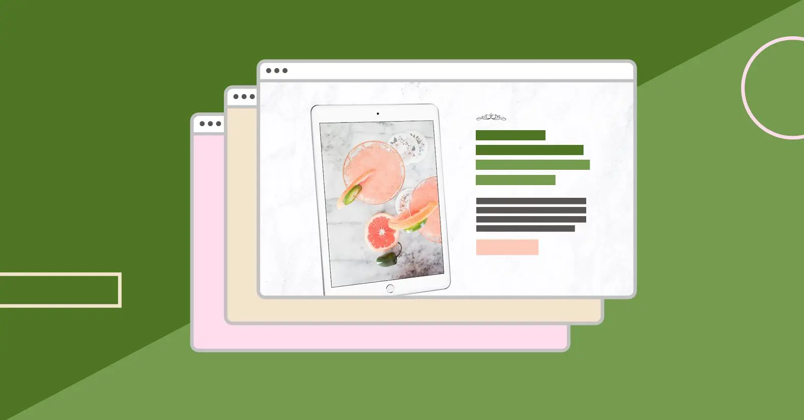
3. Absolute Dogs – Unpredictable Dog Playbook

This landing page from Absolute Dogs uses a simple design laid out with a compelling image of the free lead magnet that is offered for subscribers.
While the headline doesn’t explain the features and benefits as effectively as it could, it does include a detailed description of what’s on offer, which includes a simple opt-in area below the text.
What we liked:
What can be improved:
4. Affise – Launching A Partner Program

This clean opt-in page design from Affise uses a bold headline to instantly highlight the goal of the ebook they are offering. This is combined with illustrations which convey the Affise brand to the visitor.
Upon clicking on the call-to-action button, you’re taken to a lightbox page with instructions to opt in. The illustrative branding is continued through to this opt-in form section.
What we liked:
What can be improved:
5. Adam Hayley – Online Trainer Education Opt in page

This landing page from Adam Hayley’s Online Trainer Education stands out with its high-impact colour palette and ebook design image.
The page uses a benefit-driven headline that clearly targets a problem of this audience (closing new clients). It’s supplemented with a sub-headline that gives a timescale (on the first call) to further drive home the benefit to the visitor.